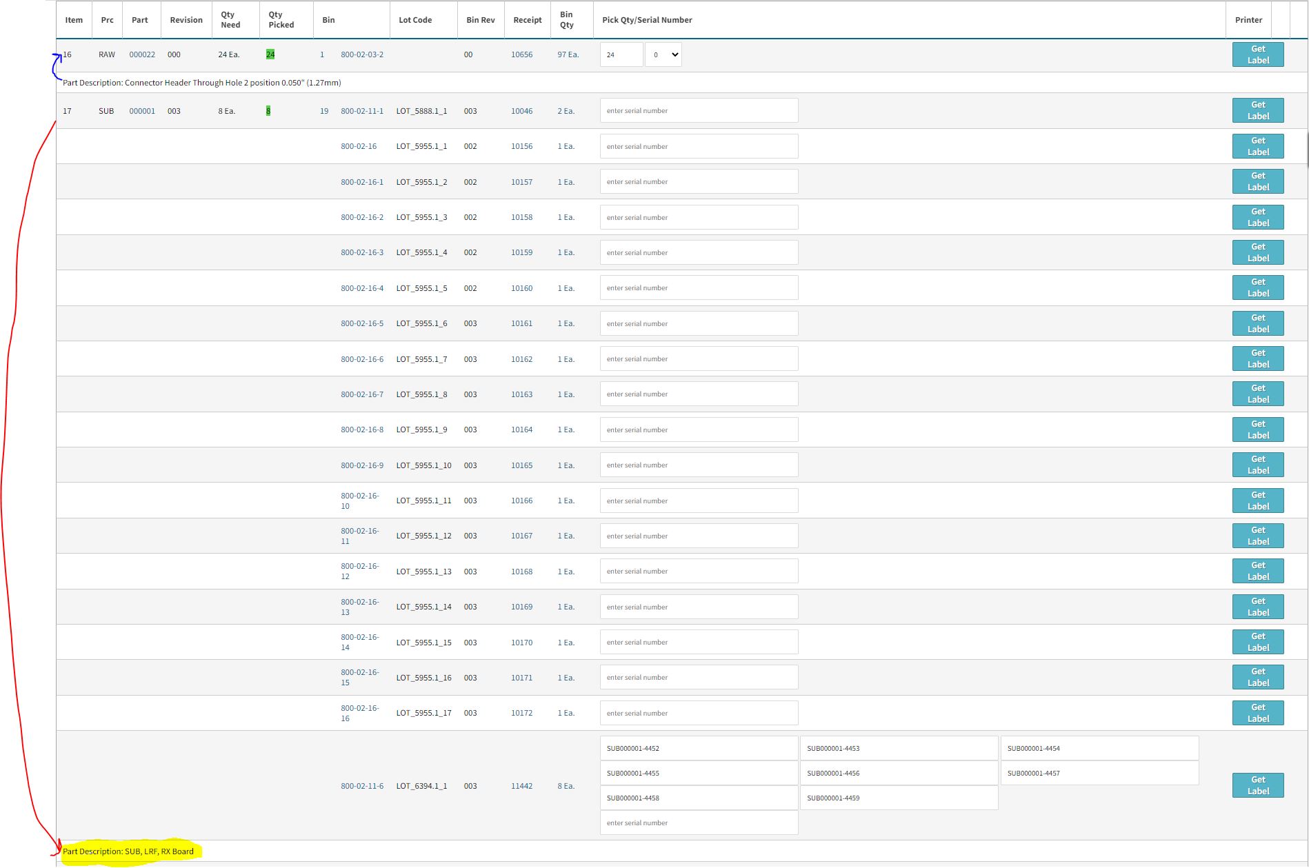
Not really a bug but more of a design annoyance from our users…
on any kitting page, for example (…/otd/order/8161/pick_parts),
- It would be nice to have the rows colors switching be logical. Right now, it just switches between lines, but it would be nice if everything for line 1 part, would be one color, then line 2 part, be the opposite color and so on…
I created a mock up version as a comparison to the current CETEC 4.051 version…
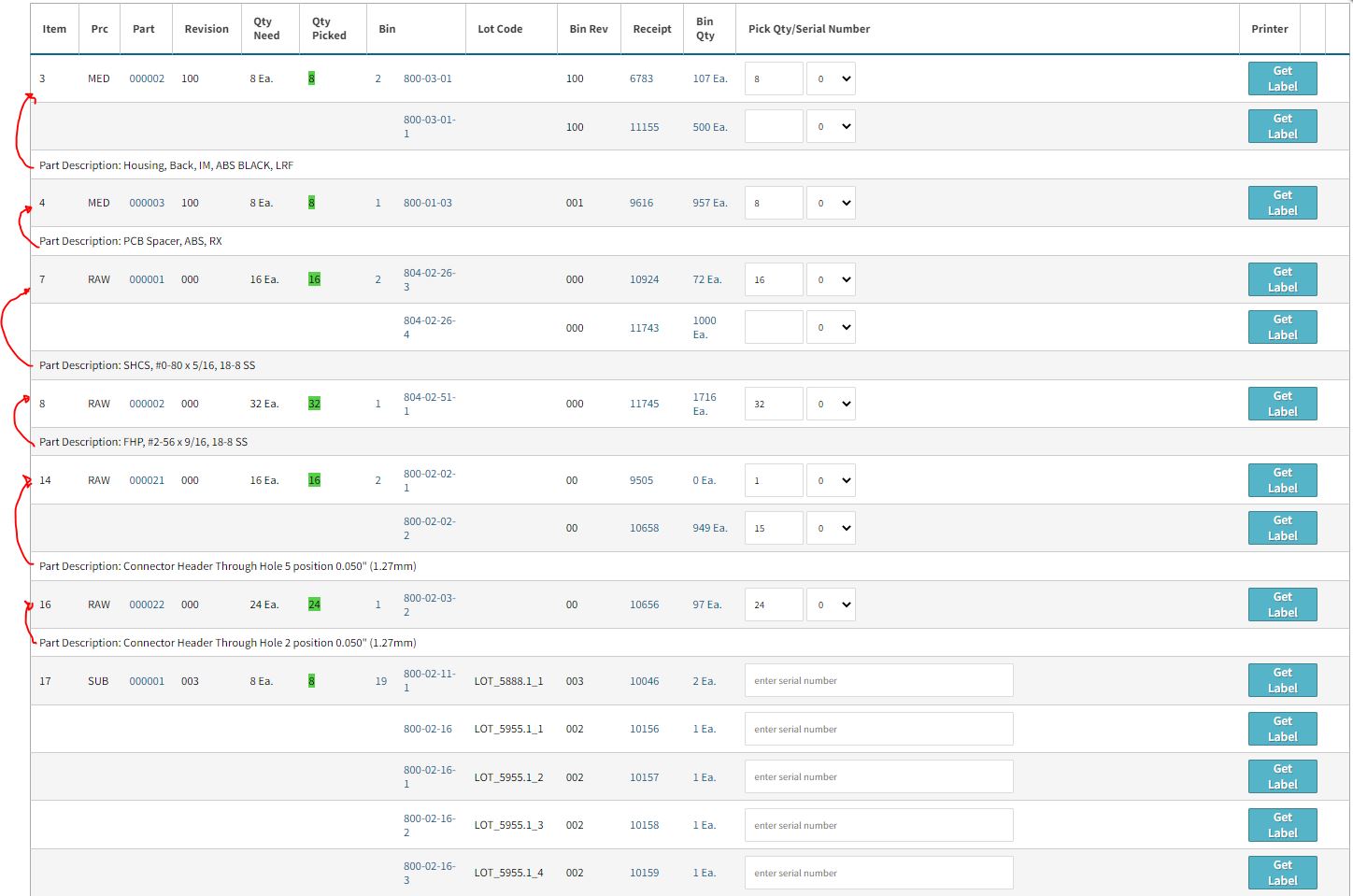
versus below which i “created” in Excel… I feel this is a cleaner way of looking at a list, especially to differentiate the parts being selected as well as the description of the part itself is above the part #. See #2 below…

- It would be nice if the description of the part was ABOVE the Line item. See image below where it is very confusing due to the # of bins of parts